/* ================= HERO HEADER ================= */ .harta-home-header { min-height: 100vh; padding: clamp(48px, 7vw, 80px) clamp(16px, 6vw, 72px) clamp(120px, 10vw, 150px); display: flex; flex-direction: column; align-items: center; justify-content: flex-start; gap: clamp(16px, 2vw, 20px); position: relative; z-index: 1; background-image: url("https://harta-concept.ch/data/files/3a8ef515-4c4b-47f3-87bc-2a38e6ff51da.jpg"); background-size: cover; background-position: center; background-repeat: no-repeat; } /* Dark overlay for readability */ .harta-home-header::before { content: ""; position: absolute; inset: 0; background: linear-gradient( rgba(0,0,0,0.45), rgba(0,0,0,0.65) ); z-index: -1; } /* Logo */ .harta-home-logo { width: clamp(180px, 26vw, 280px); height: auto; filter: drop-shadow(0 8px 30px rgba(0,0,0,0.4)); } /* Tagline */ .harta-tagline { font-size: clamp(14px, 1.4vw, 18px); color: #f5f5f5; letter-spacing: 0.05em; text-align: center; margin-top: -4px; margin-bottom: 12px; } /* Menu wrapper */ .harta-menu-wrap { position: relative; display: flex; flex-direction: column; align-items: center; width: 100%; max-width: 260px; } /* Menu button */ .harta-menu-button { border-radius: 999px; border: 1px solid #fff; background: #ffffff; padding: 10px 22px; font-size: 0.95rem; letter-spacing: 0.08em; text-transform: uppercase; cursor: pointer; display: inline-flex; align-items: center; gap: 8px; transition: all 0.25s ease; } .harta-menu-button:hover { background: #ff5fa2; color: #ffffff; border-color: #ff5fa2; } /* Hamburger icon */ .harta-menu-icon { width: 14px; height: 10px; position: relative; } .harta-menu-icon span { position: absolute; left: 0; right: 0; height: 2px; background: currentColor; border-radius: 999px; transition: 0.2s ease; } .harta-menu-icon span:nth-child(1) { top: 0; } .harta-menu-icon span:nth-child(2) { top: 4px; } .harta-menu-icon span:nth-child(3) { bottom: 0; } /* Dropdown panel (stays inside the block) */ .harta-menu-panel { margin-top: 12px; padding: 12px 0; border-radius: 16px; border: 1px solid rgba(255,255,255,0.2); background: rgba(255,255,255,0.93); backdrop-filter: blur(6px); min-width: 200px; display: grid; gap: 4px; opacity: 0; transform: translateY(-6px); pointer-events: none; transition: 0.25s ease; } .harta-menu-open .harta-menu-panel { opacity: 1; transform: translateY(0); pointer-events: auto; } /* Menu -> X */ .harta-menu-open .harta-menu-icon span:nth-child(1) { top: 4px; transform: rotate(45deg); } .harta-menu-open .harta-menu-icon span:nth-child(2) { opacity: 0; } .harta-menu-open .harta-menu-icon span:nth-child(3) { bottom: 4px; transform: rotate(-45deg); } .harta-menu-link { padding: 8px 18px; font-size: 0.95rem; text-decoration: none; color: #111; display: block; transition: 0.2s ease; } .harta-menu-link:hover { background: #f1f1f1; padding-left: 22px; } /* =============== QUICK ACCESS SECTION =============== */ .harta-quick { padding: clamp(40px, 6vw, 72px) clamp(16px, 6vw, 72px); background: #ffffff; } .harta-quick-inner { max-width: 1200px; margin: 0 auto; display: grid; gap: clamp(20px, 3vw, 32px); } .harta-quick-header { text-align: left; } .harta-quick-kicker { font-size: 12px; letter-spacing: 0.18em; text-transform: uppercase; color: #9ca3af; margin-bottom: 6px; } .harta-quick-title { font-size: clamp(22px, 3vw, 28px); font-weight: 500; margin: 0; color: #111827; } .harta-quick-grid { display: grid; grid-template-columns: 1fr; gap: clamp(16px, 2vw, 24px); } @media (min-width: 800px) { .harta-quick-grid { grid-template-columns: repeat(3, minmax(0, 1fr)); } } .harta-quick-card { position: relative; border-radius: 20px; overflow: hidden; cursor: pointer; min-height: 220px; background: #000; } .harta-quick-card img, .harta-quick-card video { width: 100%; height: 100%; object-fit: cover; transform: scale(1.02); transition: transform 0.5s ease, opacity 0.5s ease; opacity: 0.9; display: block; } .harta-quick-card::before { content: ""; position: absolute; inset: 0; background: linear-gradient( to top, rgba(0,0,0,0.8), rgba(0,0,0,0.2) ); opacity: 1; transition: opacity 0.4s ease; z-index: 1; } .harta-quick-body { position: absolute; inset: auto 18px 18px 18px; color: #f9fafb; display: grid; gap: 4px; z-index: 2; } .harta-quick-label { font-size: 11px; text-transform: uppercase; letter-spacing: 0.16em; opacity: 0.8; } .harta-quick-name { font-size: 18px; font-weight: 500; } .harta-quick-text { font-size: 13px; opacity: 0.9; } .harta-quick-card:hover img, .harta-quick-card:hover video { transform: scale(1.06); opacity: 1; } /* =============== WHAT IS HARTA SECTION =============== */ .harta-story { padding: clamp(48px, 7vw, 80px) clamp(16px, 6vw, 72px); background: #f9fafb; } .harta-story-inner { max-width: 900px; margin: 0 auto; text-align: center; display: grid; gap: clamp(18px, 2.5vw, 24px); } .harta-story-kicker { font-size: 12px; letter-spacing: 0.22em; text-transform: uppercase; color: #9ca3af; } .harta-story-title { font-size: clamp(24px, 3vw, 32px); margin: 0; color: #111827; font-weight: 500; } .harta-story-text { font-size: 15px; line-height: 1.7; color: #4b5563; } .harta-story-points { display: grid; gap: 12px; } @media (min-width: 720px) { .harta-story-points { grid-template-columns: repeat(3, minmax(0, 1fr)); text-align: left; } } .harta-story-point-title { font-size: 13px; text-transform: uppercase; letter-spacing: 0.16em; color: #111827; margin-bottom: 4px; } .harta-story-point-text { font-size: 13px; color: #6b7280; }
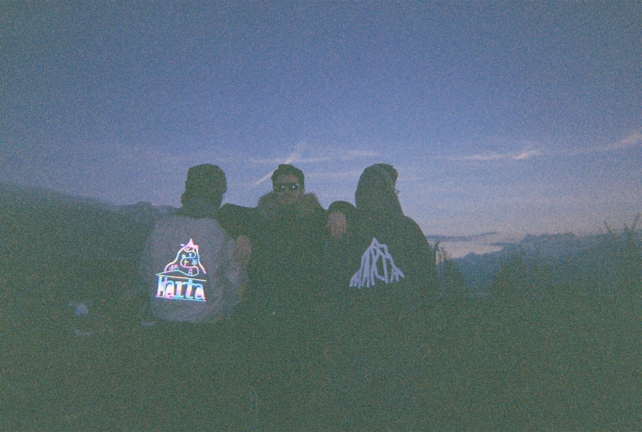
Collective energy, individual style
What is HARTA?

A home for young Swiss creators, built on collective energy and individual style.

HARTA is a space where small Swiss brands don’t get lost in the noise. We bring together local creators, conscious production and a love for culture — so you can discover pieces that feel close to home, but far from ordinary.

Swiss & local
We focus on labels rooted in Switzerland — from big cities to small villages.
Curated drops
No endless scroll. Just selected collections, limited runs and clear stories.
For creators
HARTA is also a tool: visibility, support and a simple way to join the project.
Search